Studio 276
Choose your own adventure
Project Overview
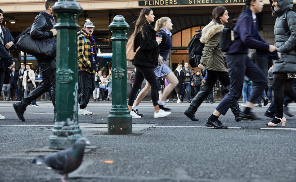
Fivex approached us to create an identity for ‘a funky new extension’ to an existing building in the cultural heart of the Melbourne CBD at 276 Flinders street. It used the same entrance as the existing 276, but the new space was accessed by taking the lift up and then entering via an enclosed, elevated walkway. They really wanted the space to feel unique, new and edgier than the existing building, to appeal to non-traditional corporates, creative industries and younger businesses. Location was the biggest driver – the space was brilliantly connected being just across the street from Flinders Street Station.

Project Brief
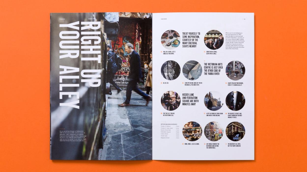
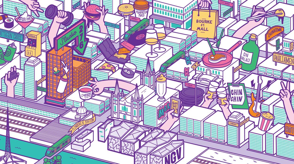
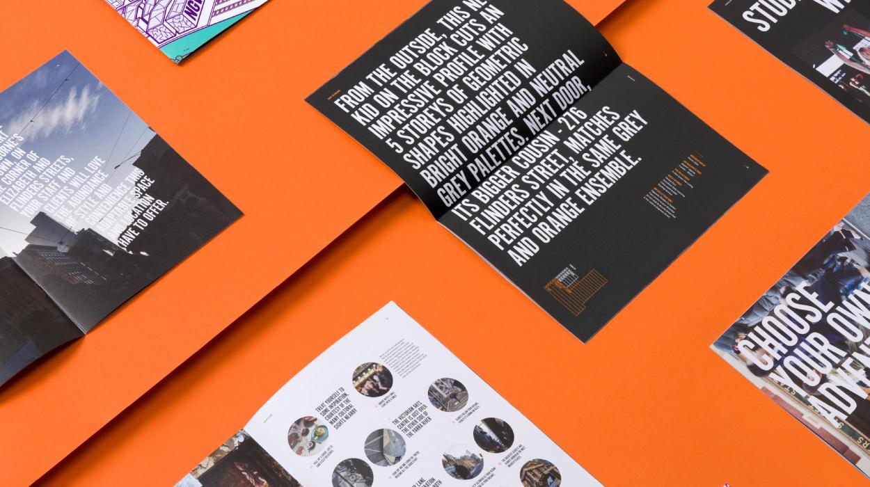
The brief was to make it edgy and non-traditional – and we knew the design approach we wanted to take to bring to life – making it all about the location and visualising the unbelievable amount of cool stuff around this part of town, then matching that with a tone-of-voice that was irreverent to make the copy and headlines have as much character as the building and its location.

Innovation
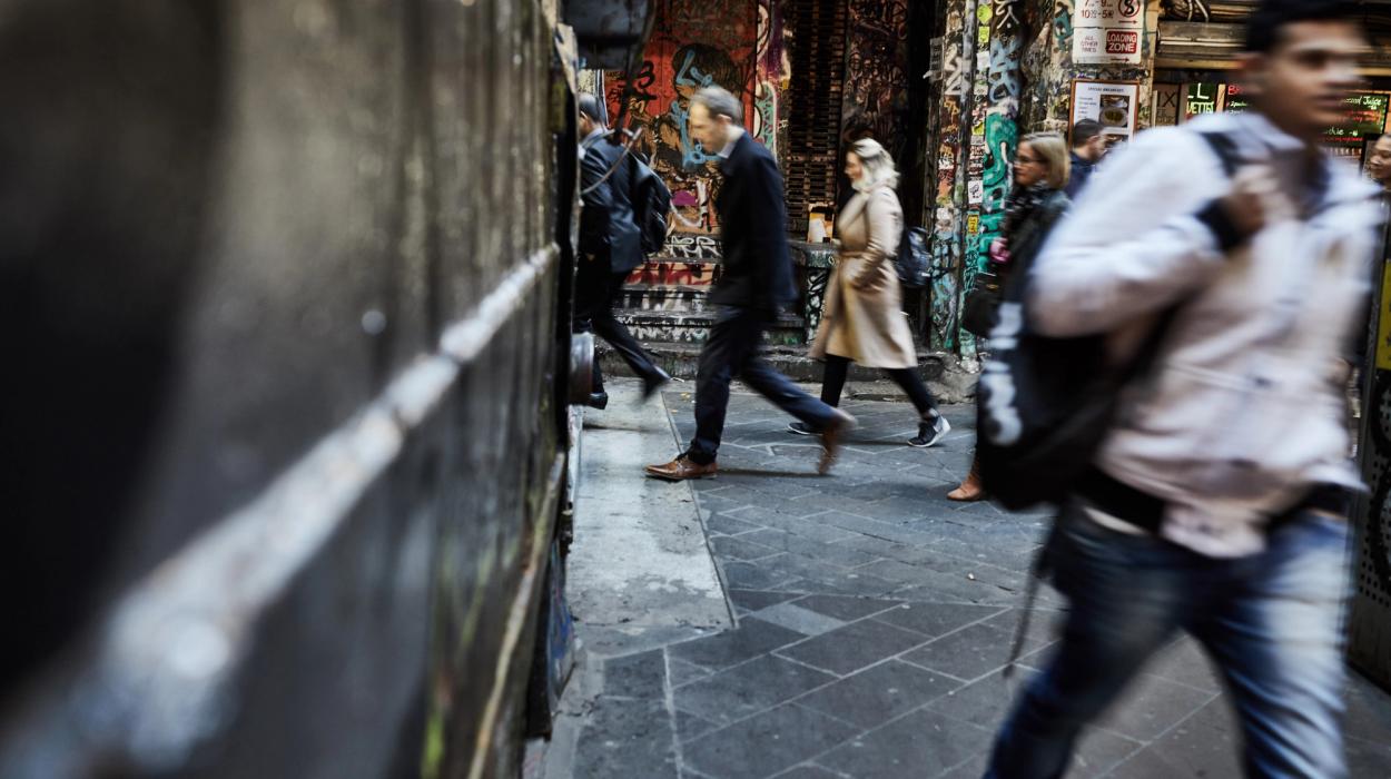
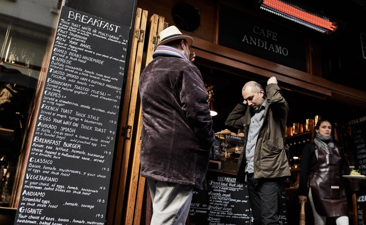
The area around Flinders Street Station is incredibly well serviced but… gritty. It’s practically the last place suit-and-tie corporates would normally search for work premises – so who would want to work here we asked ourselves?
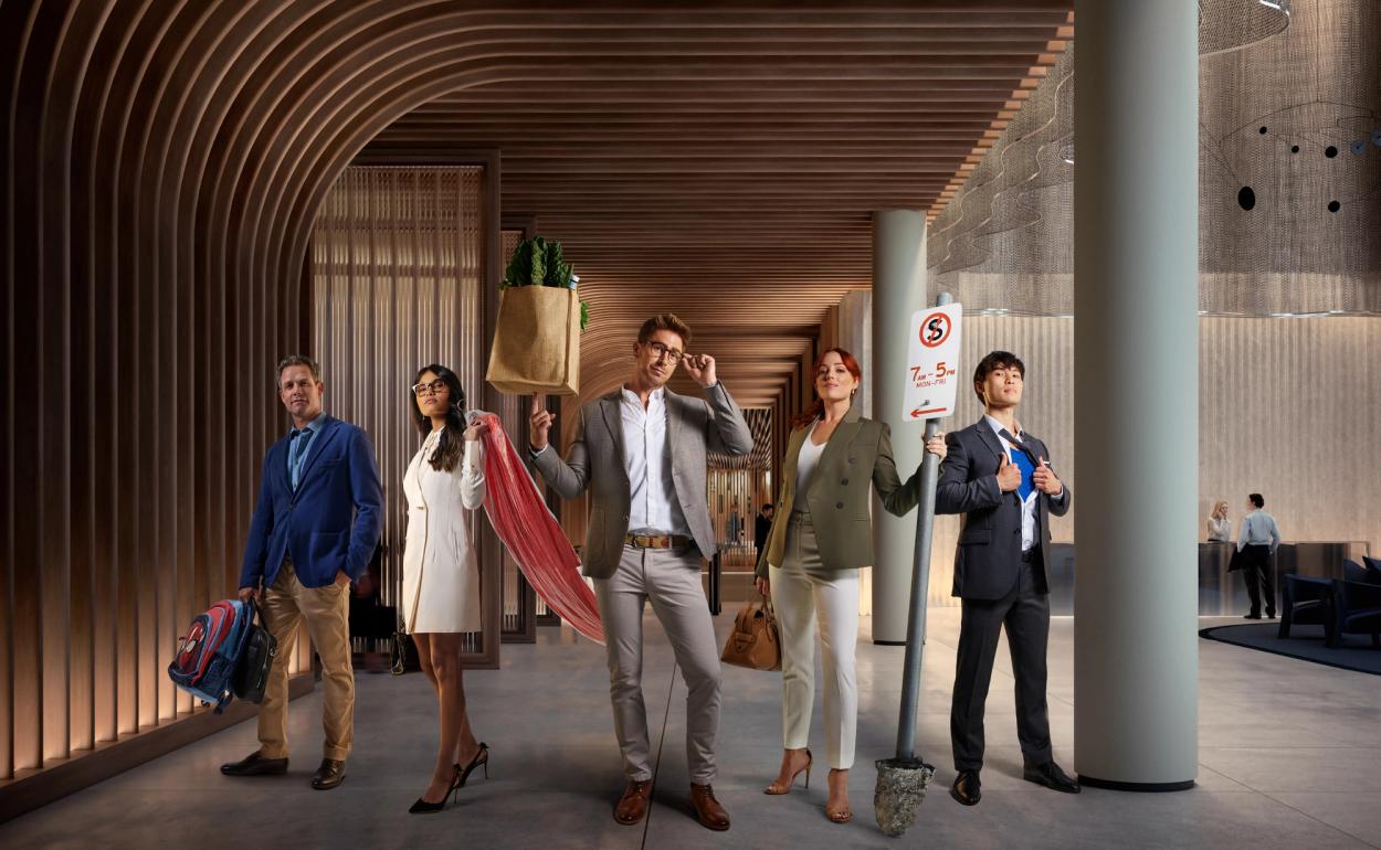
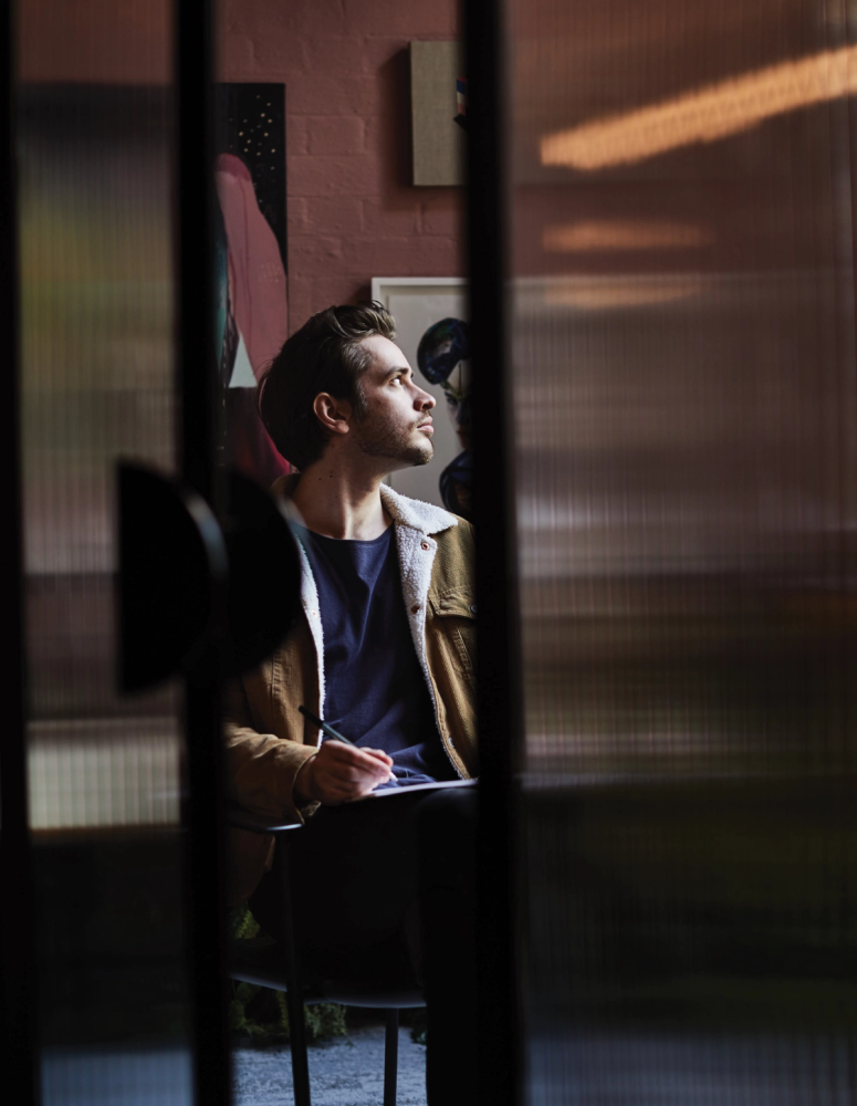
Well, people who are looking to stand out, who are the trend-starters, start-ups, idea generators, early adopters. The cool crew. The identity had to make them sit up and take notice.

Design Challenge
We started with naming based around the key locator, the street address - but with a younger & edgier slant and so Studio 276 was born. The client said, ‘make it great’. We took that to mean this was our opportunity to create a visual identity boldly different for the category.
Being a Brisbane-based design agency, wherever possible, we like to collaborate with locals on projects. No one knows a place like someone who calls it home, and Melbourne is all about authentic experiences, local secrets and insider knowledge – we needed an insider to help deliver the full Flinders experience visually.
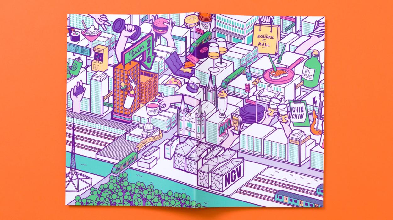
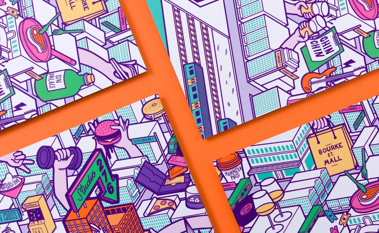
Working with local illustrator Ellen Porteus, we created a vibrant and energetic vision of the Flinders Street area – a three-dimensional illustrated map of Melbourne.
The logo reflected the modular nature of the building designed by Baldasso Cortese – light, space and industrial materials coming into play to create a dynamic environment over multiple workspace levels.
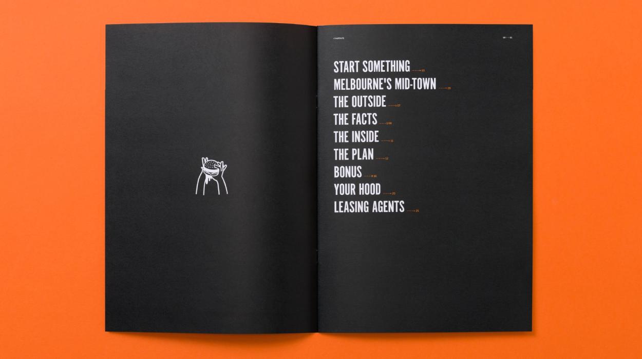
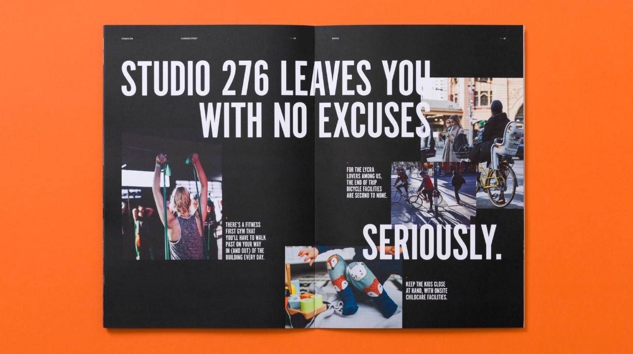
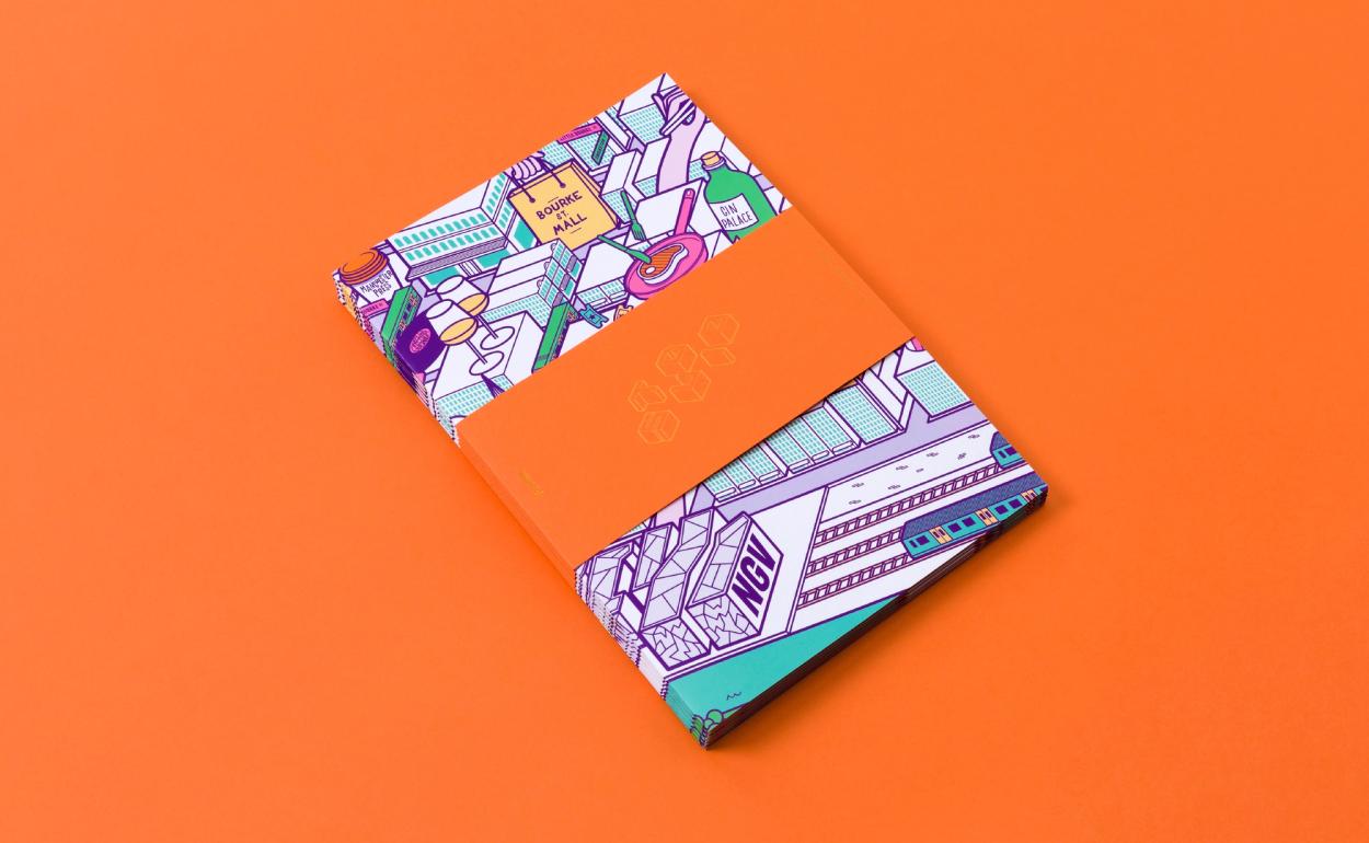
The brochure’s irreverent tone of voice and striking visuals delivered the attitude of the building with the aim of attracting prospective tenants in spades.



Effectiveness
Studio 276 was completely leased within a month of the project going live.

