Marin
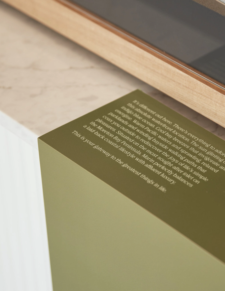
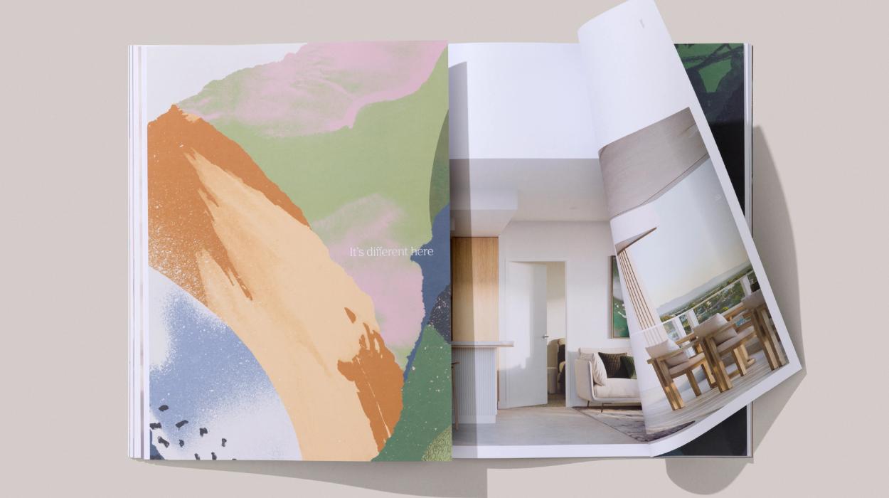
It’s different here
Project Overview
Marin is Traders in Purple’s 12th project in the sought-after Moreton Bay Peninsular and they have a deep understanding of the region, tailoring each project to its unique environment, community and purpose. The brand and identity for Marin had to be strategically resolved, thoughtful and meaningful to the project and target market, and be complimentary to the coastal location and architecture.

Project Brief
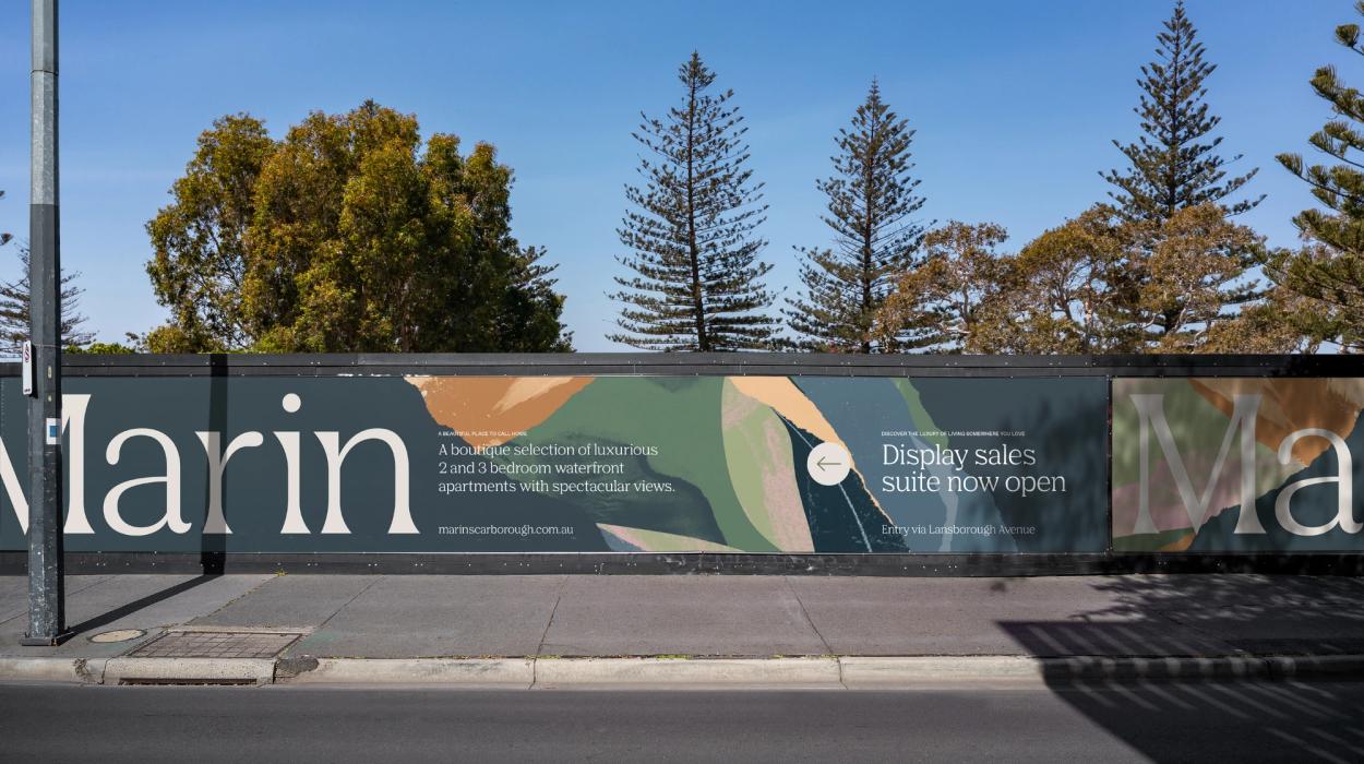
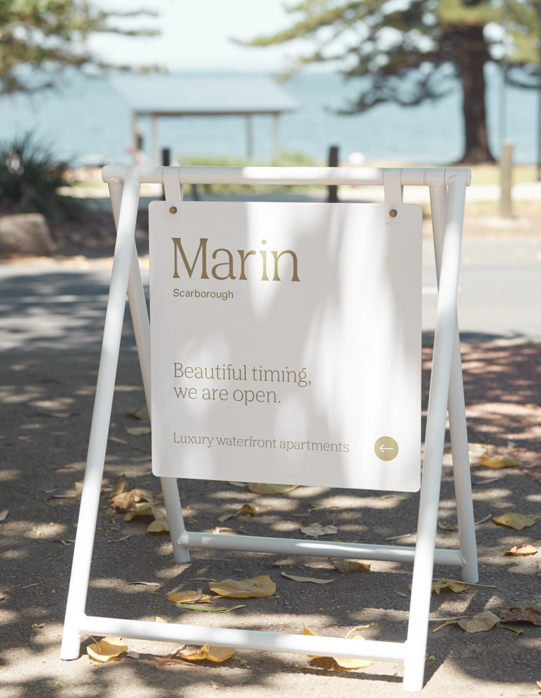
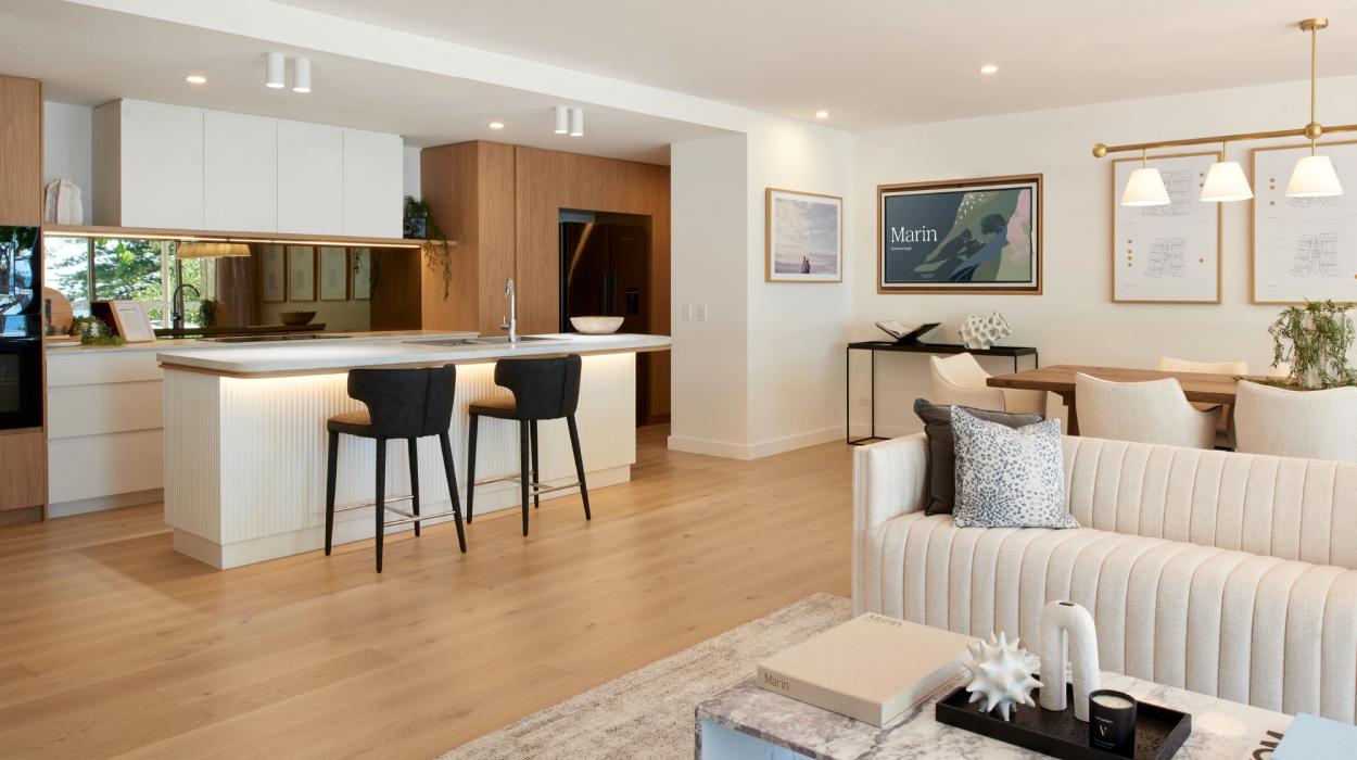
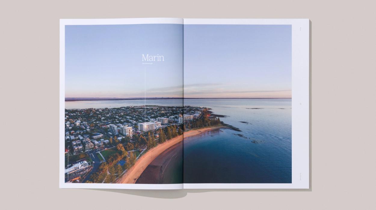
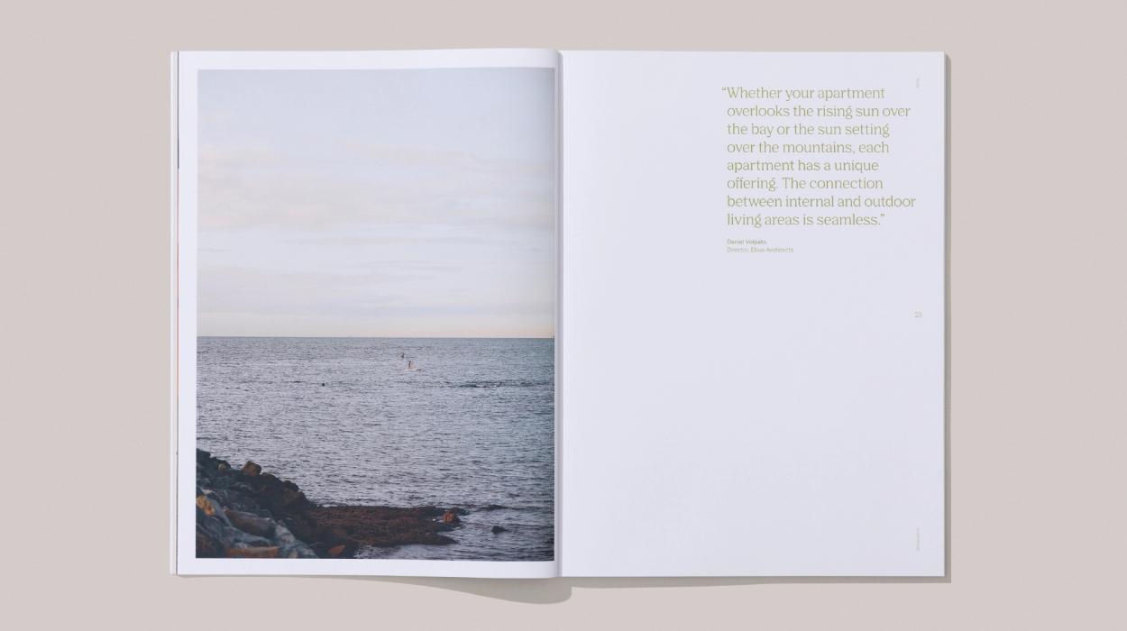
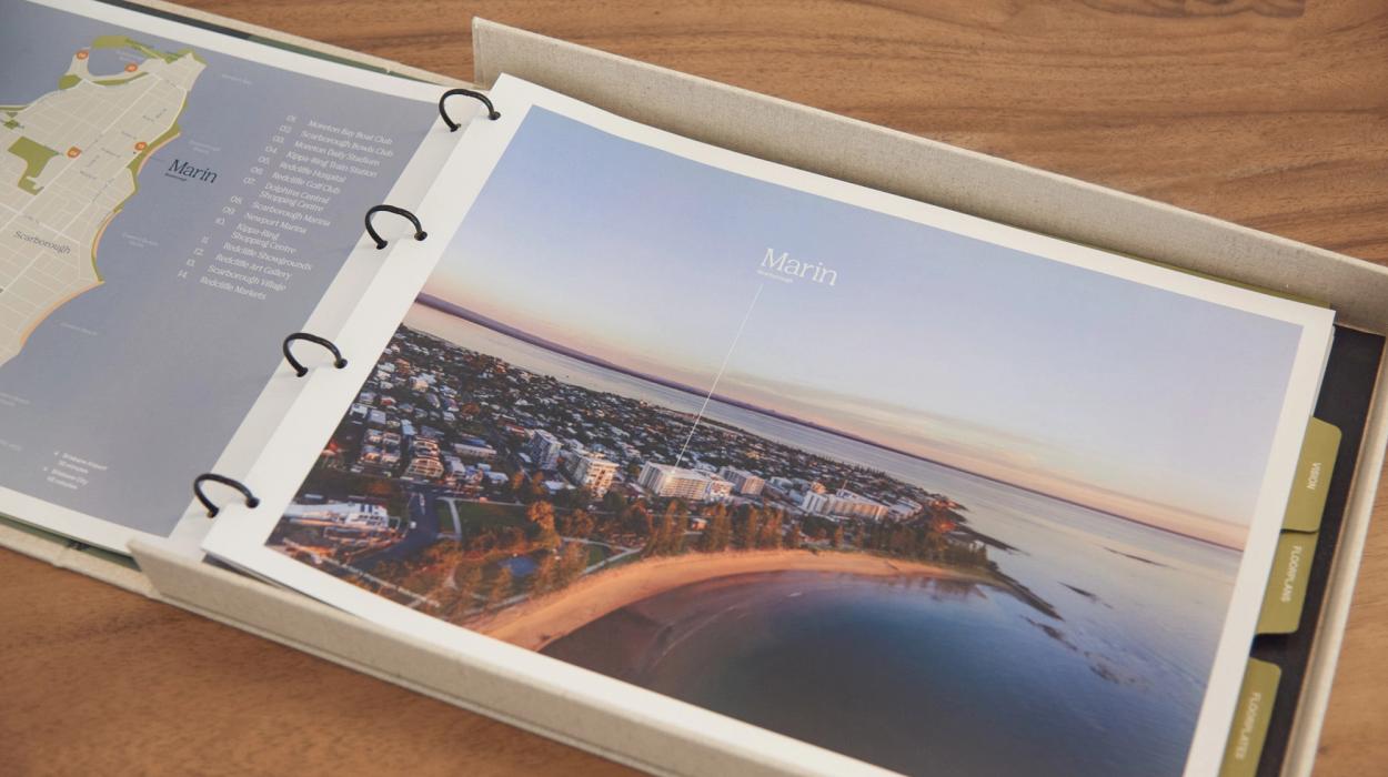
Marin inhabits an unrivalled, safe and quiet, bayside position on the leafy Landsborough Avenue Esplanade, right in the heart of desirable Scarborough Village. With a magnificent waterfront location and breathtaking panoramic views to the east across Moreton Bay, it represents everything that is quintessential to a coastal lifestyle. The brief for the Marin brand and visual identity was to harness the unique attributes of the project and its extraordinary position, to capture the essence of the place, the undulating coastline, the Norfolk pine trees framing the bay, beach, and sky.
Innovation
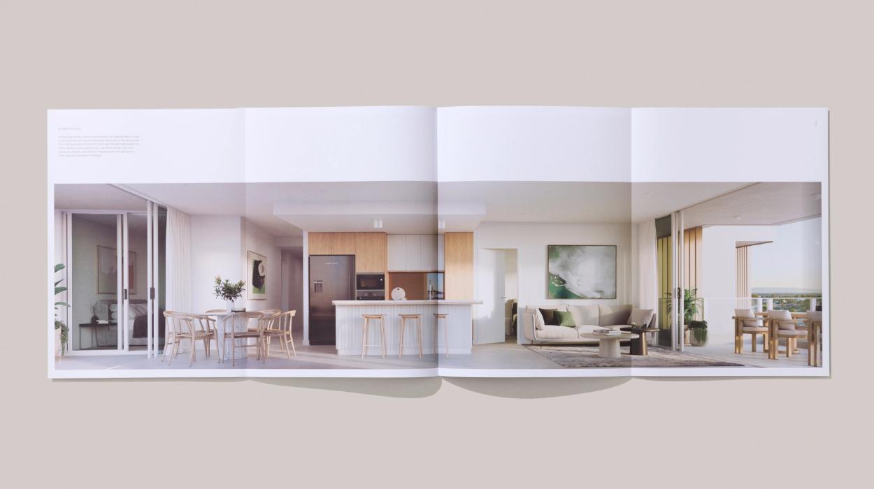
Marin at Scarborough is an invitation to appreciate all the finer, simpler things in life. The project’s fluid exterior beautifully mirrors the undulating flow of the Scarborough coastline. Carefully considered details like the uniquely concave, not convex, balconies create and enhance privacy, delivering the feeling of inhabiting a rare singular residence with spectacular bay views. The visual identity and all the collateral had to complement and enhance the feeling of ‘coming home’.


Design Challenge
How do we capture the essence of a place? Sometimes there are so many good things to convey, it’s hard to narrow it down to just one. Experience is everything. Understanding the things that crystalise an understanding of place, deliver the feeling of being within the moment and inspire a sense of belonging help to curate the experience and deliver an interaction that is both memorable and motivating.
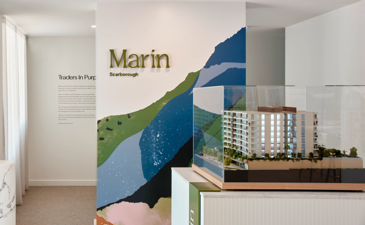
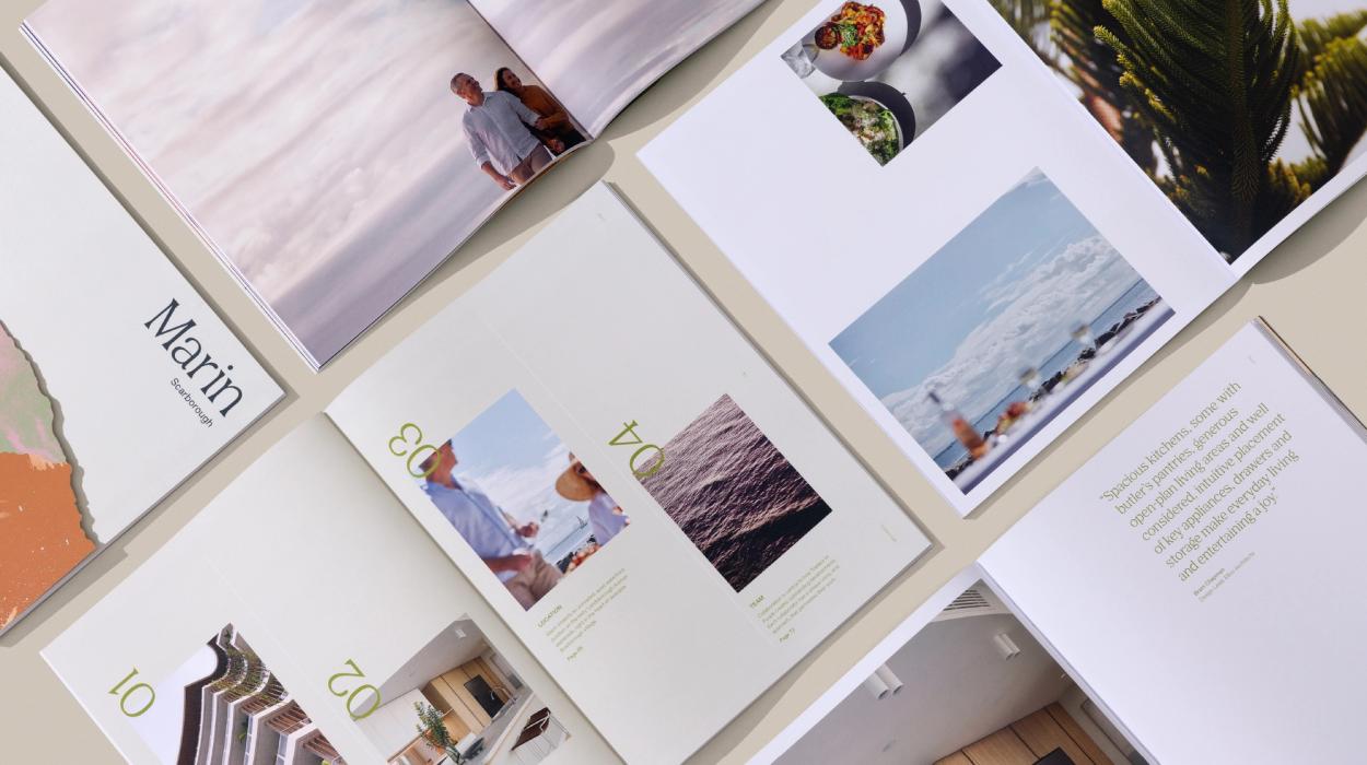
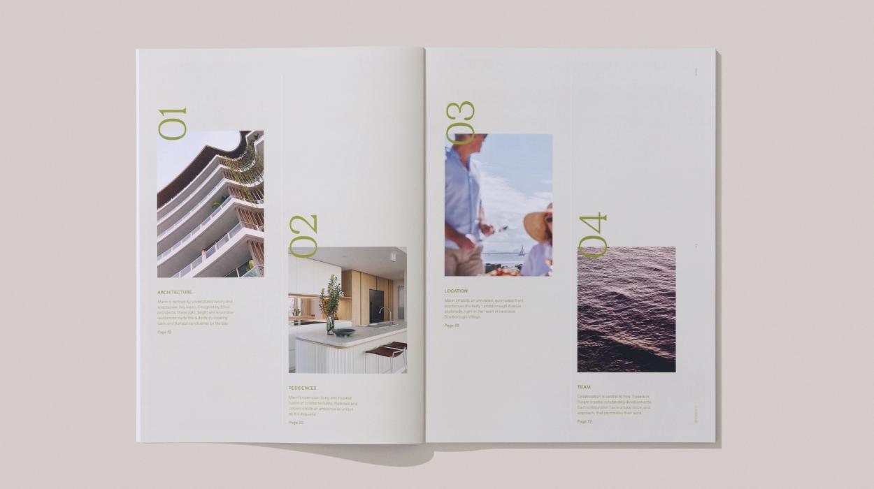
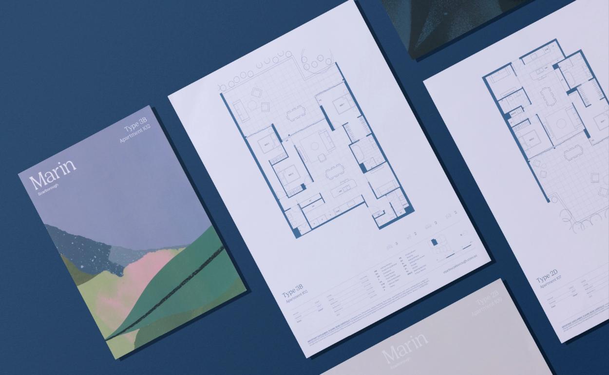
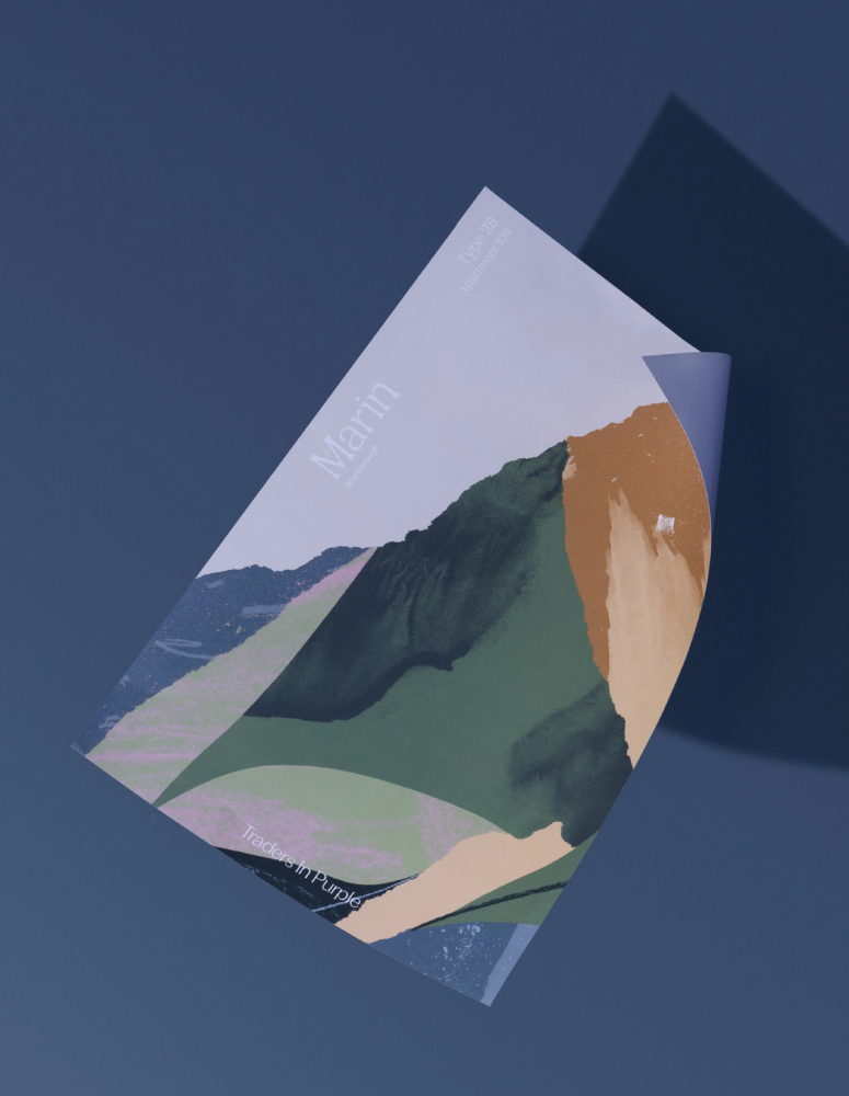
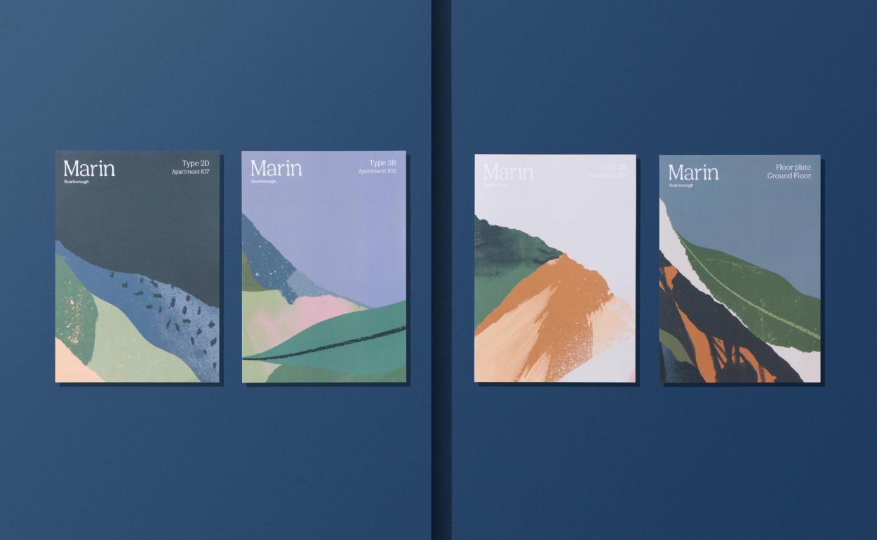
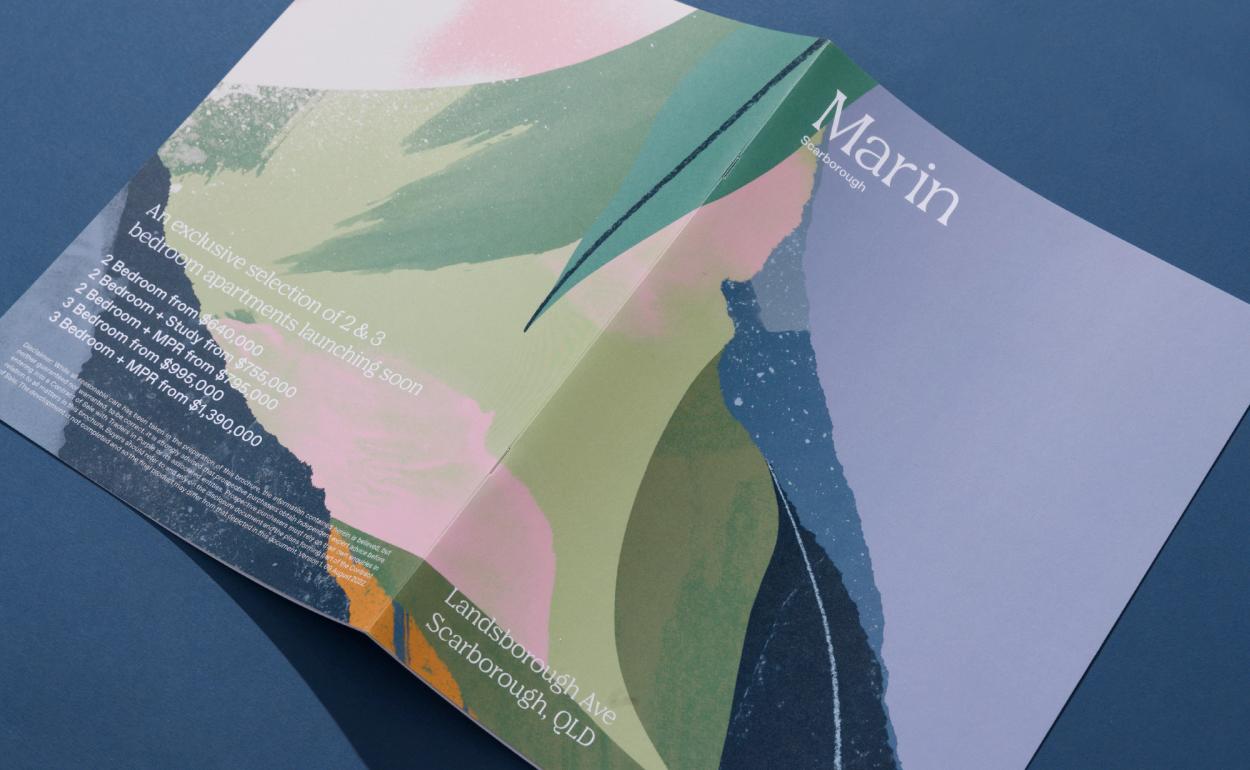
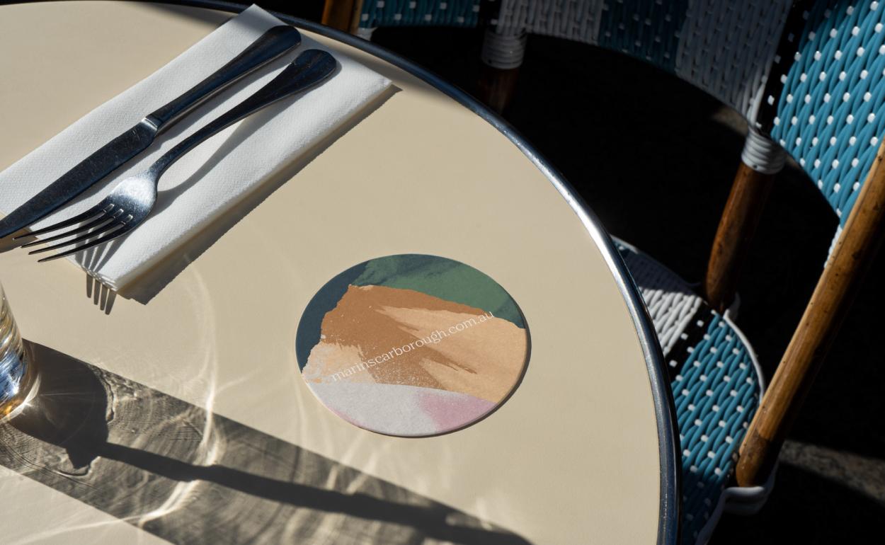
Marin’s photogenic location enabled the brand identity to step back, be more refined and channel the key defining characteristics of the project, taking inspiration from the coastal location: the red cliffs at Scarborough, the sandy beaches and, of course, the iridescent blue waters of the bay. The brochure, with illustrations by Tom Abbiss Smith cleverly mirrored the iconic topography with its specially created die cut cover.


Effectiveness
The project evokes a feeling of ‘nostalgia meets contemporary living’, inviting purchasers to enjoy a lifestyle that lets them return to the best things in life. With over 500 enquiries prior to the project going live and over 65% of the residences sold within five months of launch, it has been a resounding success.