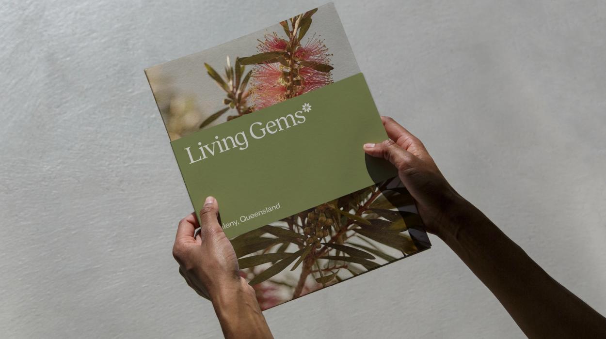
Living Gems
Simply Lifechanging
Project Overview
Living Gems was established in 1982 to be an affordable alternative to retirement living, a land-lease community with no stamp duty and no entry or exit fees - providing affordable, quality homes and great facilities. Fast forward to 2022 and the saturation of the market by other ‘over 50s resort providers’ and the competitive landscape was getting cluttered, hard to navigate and easy to get lost in.

Innovation
In a cluttered over 50s resort category, Living Gems had to stand alone, look different, speak differently (clearly, honestly) and showcase the irreverent attitude of its target audience, with humour and insight.
We needed to demonstrate that Living Gems provides a more enjoyable, connected, easy life than the one our target demographic has now. To help them grasp that it’s not just an affordable alternative to retirement living – it’s so much more (a new home, affordable, undemanding lifestyle, easy-going community) for so much less than they think.

Project Brief
Theola was engaged to evolve the Living Gems brand to be clearly differentiated and relevant to the desired target audience.
Design Challenge
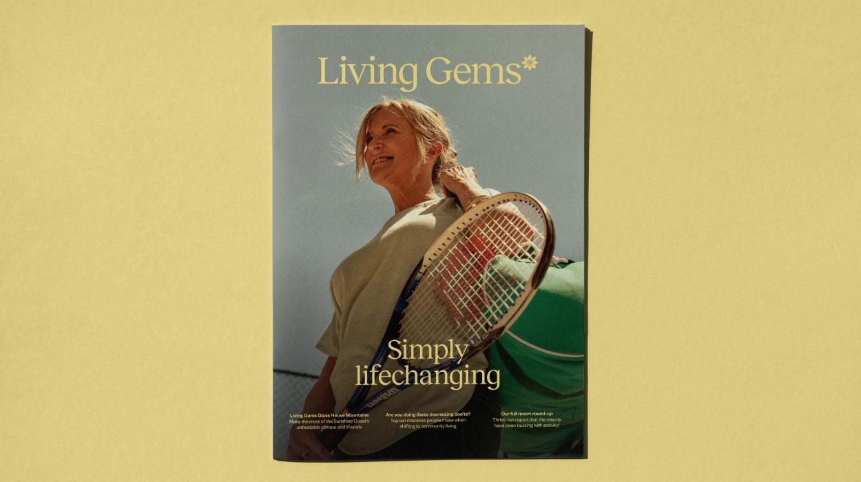
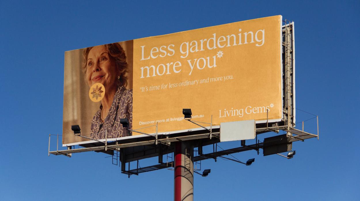
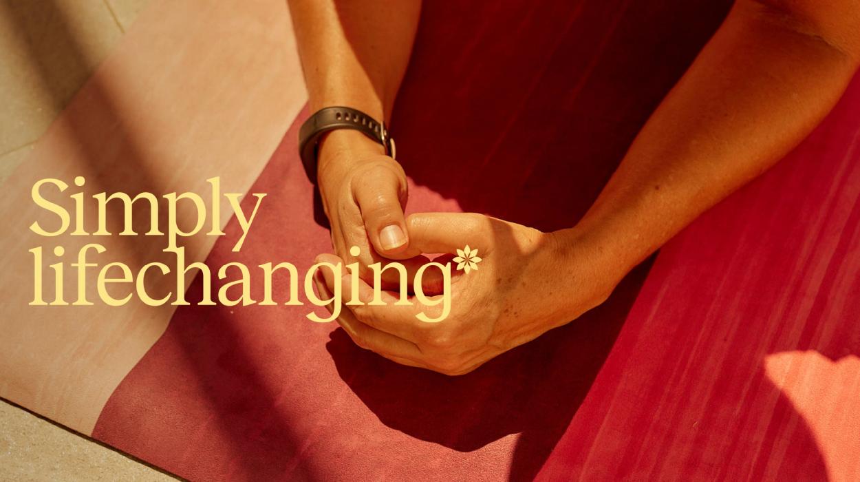
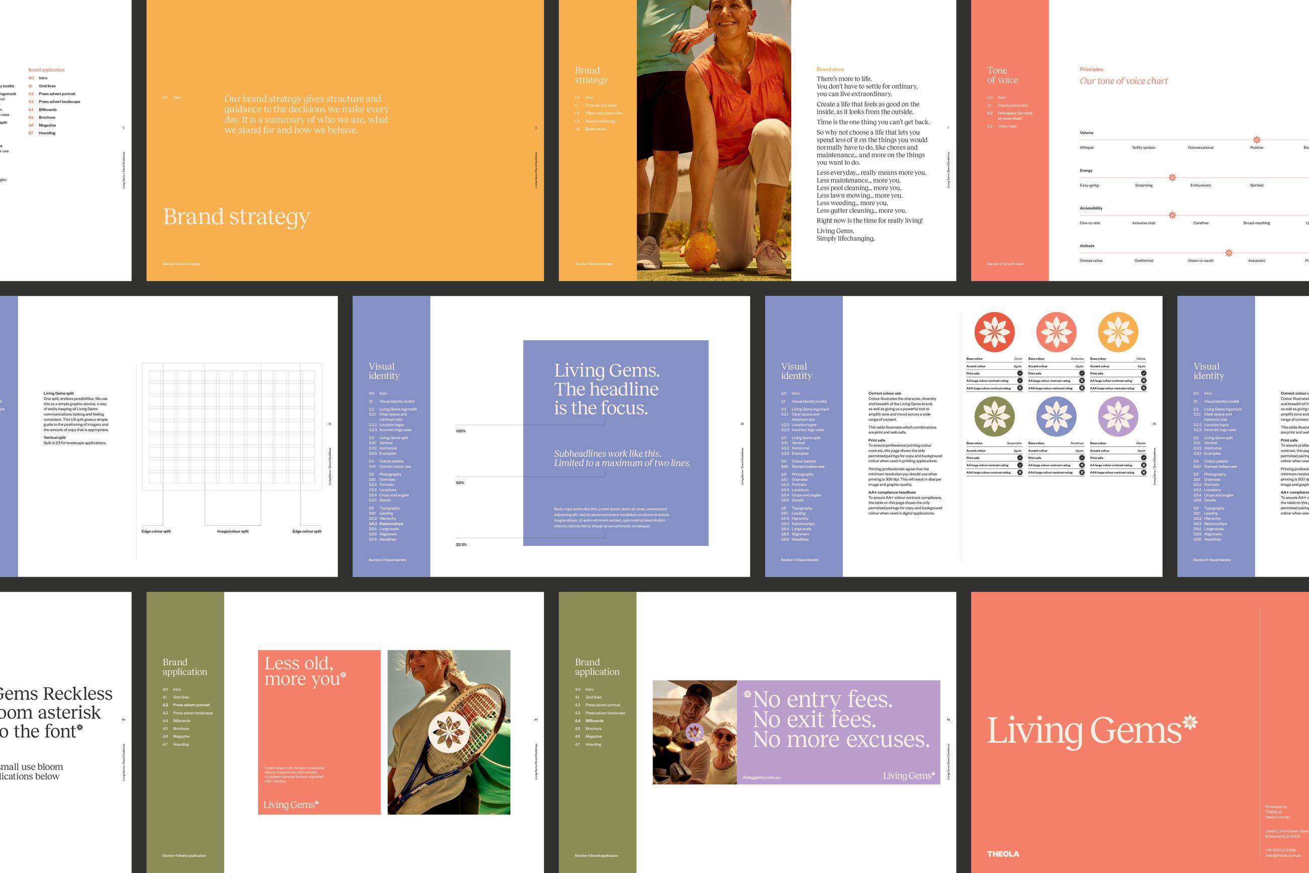
The Living Gems brand needed to evolve to become visually distinctive and sought-after. The evolved brand is a nod back to the best times in our audience’s lives – prior to having kids – and inviting them to return to those golden days – invoking a sense of ‘good times’ nostalgia and vibrant fun.
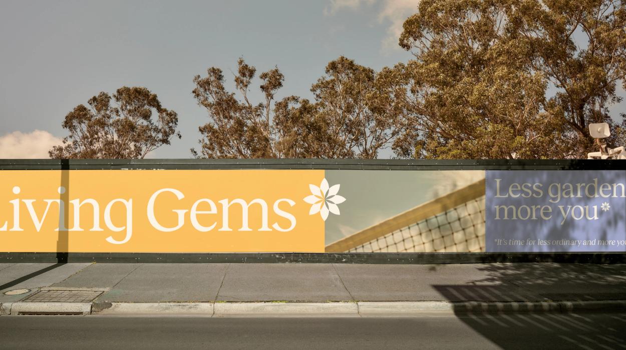
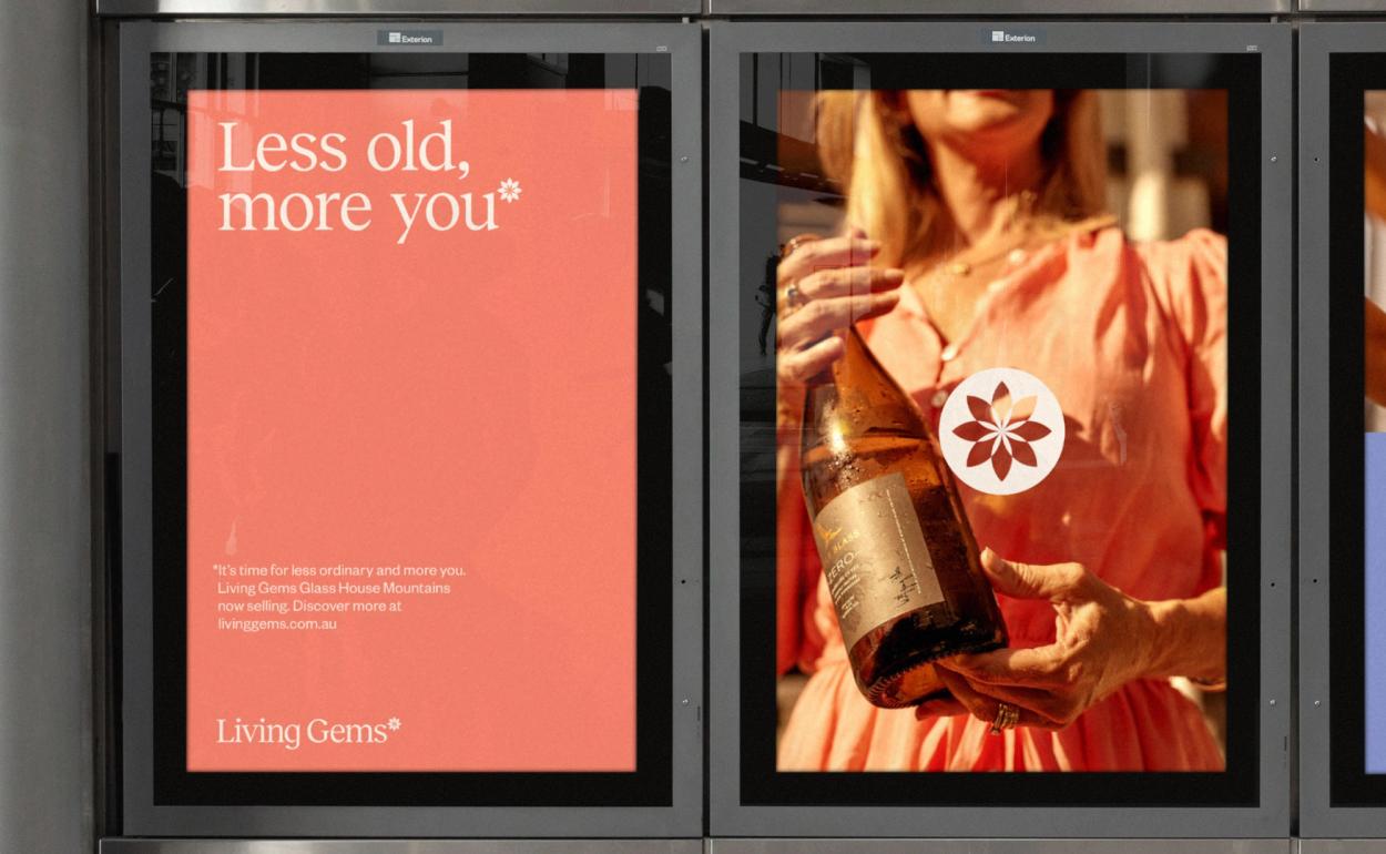
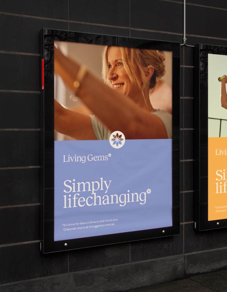
We reinterpreted and updated the Living Gems brand device: ‘The Bloom’ and now use it like an asterisk (which normally highlights that there is additional information not contained in the headline), but by supersizing the ‘bloom’ we have been able to flip the paradigm, helping our audience realise there’s more to Living Gems than they realise – and unlike traditional small print – we’re not hiding anything.
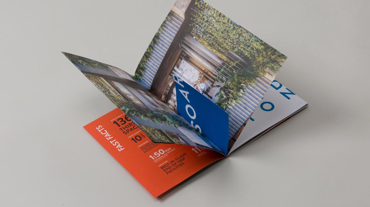
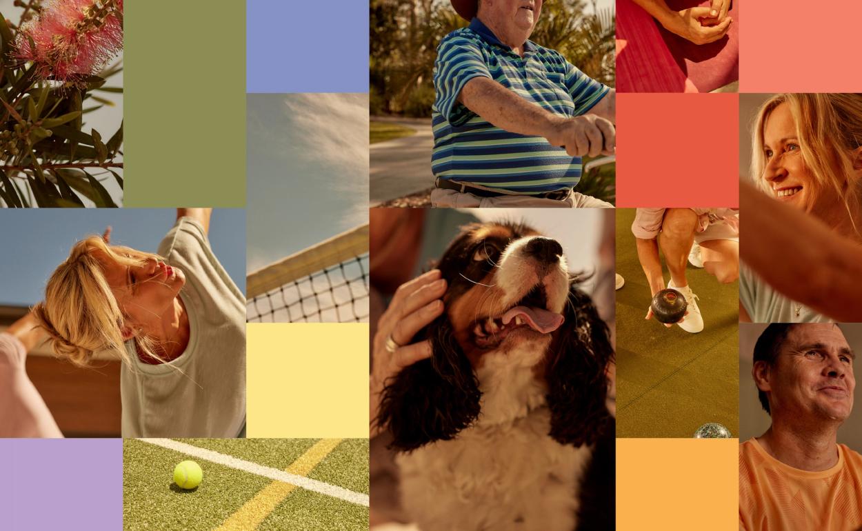
Our new proprietary brand photographic style puts a priority on warmth and tone, with unusual angles that feel ‘snap-shot-ey’ and place the audience directly in the moment. It’s now a clear and unique perspective that is refreshingly honest and differentiates Living Gems in the market.
The new flexible design system allows any coloured logo to be used over any image, allowing the brand to stay fresh and relevant ongoing.
The messaging and tone-of-voice was also updated and tailored to be more relevant and motivating to our audience. Headlines highlighted the benefits and prompted re-evaluation by being deliberately challenging in an irreverent way: ‘No entry fees. No exit fees. No more excuses.’


Effectiveness
Once we developed the new brand visual identity, tone-of-voice and messaging, and socialised and marketed it across multiple channels, we were able to build a bigger, brighter more inviting picture of what Living Gems resort living was all about and enquiries soared. Living Gems experienced a dramatic increase in website traffic and enquiry after launch, and a corresponding increase in sales.